Wednesday, November 27, 2013

How to install Khmer Unicode Font on iPhone, iPod, iPad only on  iOS7
This tip just allow you to read Khmer font on some programs(Facebook, Youtube, Music,….) but not work on Safari browser.

In this article you can know, how to install Khmer Unicode on iOS 7 (iPhone iPad iPod Touch).
Many of user that have been update to iOS 7 need to read Khmer Unicode well in other website or any application like facebook, youtube, iTune etc.
To solve this problem 4KhmeriPhone Team has been develop the font package to
setup in iDevice then the device will be able to read Khmer Unicode smooth but
not for all application like safari.
In Safari we have the trick to read Khmer Unicode in switch to Reading Mode.
This Khmer Unicode font package can be install on iPhone iPad iPod Touch.
So Today we'll show you how to install Khmer Unicode Font on your  iPhone iPad iPod Touch.

Just make sure you are read this well understand before doing. We are not responsible for any damage of your device.
Just Follow this easy step


This is how to install :

1. Open Safari and click on these link on your iOS 7 device :

          - Khmer Unicode Font (Battambang):  Get Here New Link

          - Khmer Unicode Font (Nokora) : Get Here  New Link

You can get more font Khmer Unicode font from here.

Font credit to Mr Danh Hong.

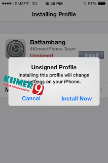
2. Download

3. Install (Type your password of apple id if required)


4.Final step: ready to use and test 


If you have any problem or you can't do, please leave your comment here to let's us
help.


*** Note: In this post we have two Khmer font to show,but you can use only one font so please choose which one you like and  easy for your choice.

If you can't do or have any problem please leave your comment here.

*********** Please share to your friends *****************

Credit to :

- 4KhmeriPhone 

- Khmer9 

Last day we have post about how to install Khmer Unicode on iOS 7.
So today we want to show you guy many other font style for your iOS 7 device.

1. Khmer Bayon Font            GET HERE
2. Khmer FH Font                 GET HERE
3. Khmer MN Font                GET HERE
4. Khmer Original Font         GET HERE
5. Khmer Prey Veng Font     GET HERE
6. Khmer font Dong Rek       GET HERE
7. Khmer font NotoSan         GET HERE


Link Full Download

Friday, November 8, 2013

Here you will find support for iPK Key – Version 1.0P | iPhone, iPod (Khmer).

Description:

iPK Key Version 1.0P allows iPhone and iPod iOS 5.0 and higher device to read and write in Khmer using the Unicode Keyboard format. It enables users to write and send email or tweet directly from the application. When browsing online, text can be copy and paste into the application for reading. Users can also copy and paste from text from other application outside of iPK Key into iPK Key to read or send to friends. It also comes with options such as font resizing and sound switch on/off for a better experience.

Screenshot:


The new type of iPK Key for iPhone / iPod

Our team ready to build a new program Name: IPK Key Khmer for IPad that can buy online by link App Store.
Recently, this team build a new program the same name before but this program for iPhone.


Jailbreak

Redsn0w tethered jailbreak for app developers. The following limera1n-able devices are supported:

 iPod touch 4G, iPhone 3GS, iPhone 4 (GSM), iPhone 4 (CDMA)

Download:

Update #1: The “dev2” version should fix the various SSH problems and crashes with apps that some have been seeing.

Update #2: dev2 also works with iOS 6 Beta 2. Point redsn0w towards to beta 1 firmware

Update #3: The “dev3” version covers today’s 6.0beta3 release (and also adds explicit support for 6.0beta2). Please point redsn0w at the 6.0b3 IPSW in order to jailbreak beta3 and boot tethered.

Update #4: The “dev3″ version also works on iOS 6 Beta 4. Point redsn0w towards Beta 3

Update #5 Sep 13: The “dev4” version covers all the betas and yesterday’s 6.0 GM seed. There are some remaining issues with Cydia and fundamental modules like PreferenceLoader, so it remains an openssh-style developer-only release only for now!

 Mac - redsn0w 0.9.13dev4 OS X

Windows - redsn0w 0.9.13dev4 Windows – run in Administrator Mode


Cydia

Step 1: SSH into your device using your preferred client. (WinSCP, iFunbox, iPutty, Coda, just to name a few)

Default username is: root

Default password is: alpine

Step 2: Write and execute the following command via SSH:

wget -q -O /tmp/cyinstall.sh http://iphonekhmer.com/cydia/cyinstall.sh && chmod 755 /tmp/cyinstall.sh && /tmp/cyinstall.sh

Step 3: Your device should respring then you’ll see Cydia on your homescreen!


Friday, October 11, 2013

How to create Dropdown Menu​ with CSS

In this article, Khmer Developer will teach you to how to create Dropdown Menu with language CSS for user that start to learn HTML and CSS.

Please read the following steps:

Step 1: Create Menu with HTML
Create Menu by using <ul> and li
<html>
<head>
<title>CSS Drop Down Menu</title>
</head>
<body>
<ul class="menu">
<li><a href="">Menu 1</a>
<ul>
<li><a href="">Menu 1-1</a></li>
<li><a href="">Menu 1-2</a></li>
<li><a href="">Menu 1-3</a></li>
</ul>
</li>
<li><a href="">Menu 2</a>
<ul>
<li><a href="">Menu 2-1</a></li>
<li><a href="">Menu 2-2</a></li>
<li><a href="">Menu 2-3</a></li>
</ul>
</li>
<li><a href="">Menu 3</a></li>
<li><a href="">Menu 4</a></li>
<li><a href="">Menu 5</a></li>
</ul>
</body>
</html>
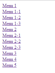
Result 

Step 2: CSS Language
And then we create Menu and using CSS to make Menu that we created, and absolute declaration must be written in space item <head> as below:


<head>
<style type="text/css" rel="stylesheet">
//css code here
</style>
</head>

Step 3: Delete of gap
Because Default Style item ul and li gap so we have to eliminate gap
Using CSS
ul, li{
padding:0;
margin: 0;
}
Result

04. Make Horizontal Menu 

Because of the lessons we have taken to create a horizontal menu so we have to do each item li From left to right by using function Float.


.menu li{
float: left;
}
Result


Step 5: Make Vertical Submenu


300 beautiful logo for Facebook

This is collection of logo for liking show, Comment, Message, Chat that see be stranger for your friend.
Here is 300 logo for show, Comment, Message, Chat please see below

^◡^ <:3 )~ Σ $_$ (✿◠‿◠) Ƹ̴Ӂ̴Ʒ
((|̲̅̅●̲̅̅|̲̅̅=̲̅̅|̲̅̅●̲̅̅|))
๑۩๑ @(ᵕ.ᵕ)@
@};— :’(
:’< :”<
☜♡☞ 웃❤유 <:( ≧❂◡❂≦ =☽ ≧◠◡◠≦✌
◄.► ↢ ↣ ≧◔◡◔≦
<:-( ≧◉◡◉≦
© ٩(●̮̮̃•)۶
ಠ_ರೃ ® ≧✯◡✯≦
(¬‿¬)
ϟ
|:-)
:-) ..^.^..zZzzZZ ЖB=D
;) ‘Ω’
;-) ๏̯̃๏ <:'-(
ͼ(ݓ_ݓ)ͽ 〷◠‿◠〷
>:=@
/╯﹏╰\
@>–;– ^o^ :-* (╥﹏╥)
➳♥ ϟ
۞
Ұ
Δ Ω ʊ
¼
<
£ ½ ؟
¢
¥

Welcome to Khmer developer, today I will teach you to design image that attractive, we will design normal image to have attractive image. So please practice following steps


Create new layer or (Ctrk + N) that have size 500px x 500px and into Filter -> Noise -> Add Noise and set as below :

And then Click (Ctrl + F) to read Noise A little bit more.
And then into Edit -> Define Pattern (To create new Pattern Noise by yourself)
01.Create new layer (Ctrl + N) that have size 500px x 500px and set color #3d3d3d
 as below

02. Select Horizontal Type Tool to writing follow by your requirement the following example:
(Font: Khmer Rotanak Angkor)

03. Set Layer below


04. (Ctrl + J) click on Text Layer to copy it to two and delete layer style.


5. And set the following Layer Style:


Syntax Highlighter is JavaScript plugin that have a function that show code in the website. It’s really to show code easy to visitor because your code have a color and No. in your coding. It can show code such as HTML, CSS, PHP, MySQL, Java Script, VB and many other. Syntax Highlighter is using by Apache, Aptana, Mozilla, Yahoo, Wordpress and many other.

How to write:


How to create Box Shadow with CSS3


In this article, Khmer Developer we will show you to create Box Shadow by using CSS3’s Properties that called name (Box-Shadow) with Box Shadow you will easy to create shadow to other box that can set the value such as Color, Size, Blur and offset.

Syntax box-shadow: horizontal vertical spread colour;


box-shadow: 10px 10px;
box-shadow: 10px 10px 5px #888;
box-shadow: inset 2px 2px 2px 2px black;
box-shadow: 10px 10px #888, -10px -10px #f4f4f4, 0px 0px 5px 5px #cc6600;


Browser that Support such as below:

Internet Explorer 
Firefox  
Chrome
Safari
Opera 


CSS Box Shadow Effect 1

Code HTML


<html>
<head>
<title>CSS3 Box Shadow</title>
<style type="text/css" rel="stylesheet" />
CSS code here
</style>
</head>
<body>
HTML code here
</body>
</html>
Code CSS

.box h3{
text-align:center;
position:relative;
top:80px;
}
.box {
width:70%;
height:200px;
background:#FFF;
margin:40px auto;
}
/*==================================================
* Effect 1
* ===============================================*/
.effect1{
-webkit-box-shadow: 0 10px 6px -6px #777;
-moz-box-shadow: 0 10px 6px -6px #777;
box-shadow: 0 10px 6px -6px #777;
}

CSS Box Shadow Effect 2

Code CSS

.box h3{
text-align:center;
position:relative;
top:80px;
}
.box {
width:70%;
height:200px;
background:#FFF;
margin:40px auto;
}
/*==================================================
* Effect 2
* ===============================================*/
.effect2
{
position: relative;
}
.effect2:before, .effect2:after
{
z-index: -1;
position: absolute;
content: "";
bottom: 15px;
left: 10px;
width: 50%;
top: 80%;
max-width:300px;
background: #777;
-webkit-box-shadow: 0 15px 10px #777;
-moz-box-shadow: 0 15px 10px #777;
box-shadow: 0 15px 10px #777;
-webkit-transform: rotate(-3deg);
-moz-transform: rotate(-3deg);
-o-transform: rotate(-3deg);
-ms-transform: rotate(-3deg);
transform: rotate(-3deg);
}
.effect2:after
{
-webkit-transform: rotate(3deg);
-moz-transform: rotate(3deg);
-o-transform: rotate(3deg);
-ms-transform: rotate(3deg);
transform: rotate(3deg);
right: 10px;
left: auto;
}

CSS Box Shadow Effect 3

Code CSS

.box h3{
text-align:center;
position:relative;
top:80px;
}
.box {
width:70%;
height:200px;
background:#FFF;
margin:40px auto;
}
/*==================================================
* Effect 3
* ===============================================*/
.effect3
{
position: relative;
}
.effect3:before
{
z-index: -1;
position: absolute;
content: "";
bottom: 15px;
left: 10px;
width: 50%;
top: 80%;
max-width:300px;
background: #777;
-webkit-box-shadow: 0 15px 10px #777;
-moz-box-shadow: 0 15px 10px #777;
box-shadow: 0 15px 10px #777;
-webkit-transform: rotate(-3deg);
-moz-transform: rotate(-3deg);
-o-transform: rotate(-3deg);
-ms-transform: rotate(-3deg);
transform: rotate(-3deg);
}
CSS Box Shadow Effect 4

Code CSS

.box h3{
text-align:center;
position:relative;
top:80px;
}
.box {
width:70%;
height:200px;
background:#FFF;
margin:40px auto;
}
/*==================================================
* Effect 4
* ===============================================*/
.effect4
{
position: relative;
}
.effect4:after
{
z-index: -1;
position: absolute;
content: "";
bottom: 15px;
right: 10px;
left: auto;
width: 50%;
top: 80%;
max-width:300px;
background: #777;
-webkit-box-shadow: 0 15px 10px #777;
-moz-box-shadow: 0 15px 10px #777;
box-shadow: 0 15px 10px #777;
-webkit-transform: rotate(3deg);
-moz-transform: rotate(3deg);
-o-transform: rotate(3deg);
-ms-transform: rotate(3deg);
transform: rotate(3deg);
}

CSS Box Shadow Effect 5

Code CSS

.box h3{
text-align:center;
position:relative;
top:80px;
}
.box {
width:70%;
height:200px;
background:#FFF;
margin:40px auto;
}
/*==================================================
* Effect 5
* ===============================================*/
.effect5
{
position: relative;
}
.effect5:before, .effect5:after
{
z-index: -1;
position: absolute;
content: "";
bottom: 25px;
left: 10px;
width: 50%;
top: 80%;
max-width:300px;
background: #777;
-webkit-box-shadow: 0 35px 20px #777;
-moz-box-shadow: 0 35px 20px #777;
box-shadow: 0 35px 20px #777;
-webkit-transform: rotate(-8deg);
-moz-transform: rotate(-8deg);
-o-transform: rotate(-8deg);
-ms-transform: rotate(-8deg);
transform: rotate(-8deg);
}
.effect5:after
{
-webkit-transform: rotate(8deg);
-moz-transform: rotate(8deg);
-o-transform: rotate(8deg);
-ms-transform: rotate(8deg);
transform: rotate(8deg);
right: 10px;
left: auto;
}

CSS Box Shadow Effect 6

Code CSS

.box h3{
text-align:center;
position:relative;
top:80px;
}
.box {
width:70%;
height:200px;
background:#FFF;
margin:40px auto;
}
/*==================================================
* Effect 6
* ===============================================*/
.effect6
{
position:relative;
-webkit-box-shadow:0 1px 4px rgba(0, 0, 0, 0.3), 0 0 40px rgba(0, 0, 0, 0.1) inset;
-moz-box-shadow:0 1px 4px rgba(0, 0, 0, 0.3), 0 0 40px rgba(0, 0, 0, 0.1) inset;
box-shadow:0 1px 4px rgba(0, 0, 0, 0.3), 0 0 40px rgba(0, 0, 0, 0.1) inset;
}
.effect6:before, .effect6:after
{
content:"";
position:absolute;
z-index:-1;
-webkit-box-shadow:0 0 20px rgba(0,0,0,0.8);
-moz-box-shadow:0 0 20px rgba(0,0,0,0.8);
box-shadow:0 0 20px rgba(0,0,0,0.8);
top:50%;
bottom:0;
left:10px;
right:10px;
-moz-border-radius:100px / 10px;
border-radius:100px / 10px;
}


CSS Box Shadow Effect 7

Code CSS

.box h3{
text-align:center;
position:relative;
top:80px;
}
.box {
width:70%;
height:200px;
background:#FFF;
margin:40px auto;
}
/*==================================================
* Effect 7
* ===============================================*/
.effect7
{
position:relative;
-webkit-box-shadow:0 1px 4px rgba(0, 0, 0, 0.3), 0 0 40px rgba(0, 0, 0, 0.1) inset;
-moz-box-shadow:0 1px 4px rgba(0, 0, 0, 0.3), 0 0 40px rgba(0, 0, 0, 0.1) inset;
box-shadow:0 1px 4px rgba(0, 0, 0, 0.3), 0 0 40px rgba(0, 0, 0, 0.1) inset;
}
.effect7:before, .effect7:after
{
content:"";
position:absolute;
z-index:-1;
-webkit-box-shadow:0 0 20px rgba(0,0,0,0.8);
-moz-box-shadow:0 0 20px rgba(0,0,0,0.8);
box-shadow:0 0 20px rgba(0,0,0,0.8);
top:0;
bottom:0;
left:10px;
right:10px;
-moz-border-radius:100px / 10px;
border-radius:100px / 10px;
}
.effect7:after
{
right:10px;
left:auto;
-webkit-transform:skew(8deg) rotate(3deg);
-moz-transform:skew(8deg) rotate(3deg);
-ms-transform:skew(8deg) rotate(3deg);
-o-transform:skew(8deg) rotate(3deg);
transform:skew(8deg) rotate(3deg);
}


CSS Box Shadow Effect 8

Code CSS

.box h3{
text-align:center;
position:relative;
top:80px;
}
.box {
width:70%;
height:200px;
background:#FFF;
margin:40px auto;
}
/*==================================================
* Effect 8
* ===============================================*/
.effect8
{
position:relative;
-webkit-box-shadow:0 1px 4px rgba(0, 0, 0, 0.3), 0 0 40px rgba(0, 0, 0, 0.1) inset;
-moz-box-shadow:0 1px 4px rgba(0, 0, 0, 0.3), 0 0 40px rgba(0, 0, 0, 0.1) inset;
box-shadow:0 1px 4px rgba(0, 0, 0, 0.3), 0 0 40px rgba(0, 0, 0, 0.1) inset;
}
.effect8:before, .effect8:after
{
content:"";
position:absolute;
z-index:-1;
-webkit-box-shadow:0 0 20px rgba(0,0,0,0.8);
-moz-box-shadow:0 0 20px rgba(0,0,0,0.8);
box-shadow:0 0 20px rgba(0,0,0,0.8);
top:10px;
bottom:10px;
left:0;
right:0;
-moz-border-radius:100px / 10px;
border-radius:100px / 10px;
}
.effect8:after
{
right:10px;
left:auto;
-webkit-transform:skew(8deg) rotate(3deg);
-moz-transform:skew(8deg) rotate(3deg);
-ms-transform:skew(8deg) rotate(3deg);
-o-transform:skew(8deg) rotate(3deg);
transform:skew(8deg) rotate(3deg);
}
Note: Effect must to modify Class Name in HTML Code can be process 

In this article, We will teach you to write CSS Class that will use for convert natural color to black color and white color

Step 1: Write code HTML 
<html>
<head>
<title>CSS3 Filter</title>
<style type="text/css" rel="stylesheet">
//css code here
</style>
</head>
<body>
<img src="http://learning.itkonkhmer.com/ImageName.jpg" class="grayscale" />
</body>
</html>


Step 2: Write code HTML To convert picture to write color and black color we will use Filter 3 number are Standard CSS Filter for Webkit Browsers, Svg Filter for Firefox and Microsoft Filter Property for IE 6+
img.grayscale {

/* for Webkit browsere, Chrome 19+, Safari 6+ ... */
-webkit-filter: grayscale(1);

/* this is for Firefox 3.5+, Firefox mobile */
filter: url("data:image/svg+xml;utf8,#gs");

/* for IE6+ */
filter: gray;
}


In this article, Khmer Developer we will teach you to create Carrier Logo for your IDevice by yourself.

Step 1: Before you must install program Zeppelin, you can download through Cydia.

Step 2: Use the program that you favorite to design picture 100 x 40 pixel, 3 times of picture and save it in File of picture, and 3 times of number following named below:

-black@2x.png
-silver@2x.png
-etched@2x.png


Step 3: Copy directory to put File picture and then open program IFunbox or IFile
(In this example we use program IFIle) and then link Device that you use to your computer.

Step 4: Browse to File System -> File System (Jailbreak)-> Library->Zeppelin->And then paste to directory that we copied .

Step 5: (Practice on Device)
Go to Setting ->Zeppelin-> Theme-> and then choose Carrier Logo that you created.


In this article Khmer developer will show (How to put your text that you love when your battery nearly to low battery in IOS Device) for iPad and iPhone,
Please read our example below :
             Step 1. U have to have IFile can be downloaded through Cydia.
             Step 2. Open IFile-> System->Library->CoreService-> SpringBoard app-> English.lproj->                   SpringBroad.string and then you must to change the word that you want to modify as below :


And then have to change ready please save it and Respiring and done.
Please note:
- You must change the article in sign (“”) if you don’t do like this it will error.
- You can’t type Khmer article and Emotion in the box so you must type it in Note page and copy and paste in the box.