Friday, October 11, 2013

How to create Dropdown Menu​ with CSS

In this article, Khmer Developer will teach you to how to create Dropdown Menu with language CSS for user that start to learn HTML and CSS.

Please read the following steps:

Step 1: Create Menu with HTML
Create Menu by using <ul> and li
<html>
<head>
<title>CSS Drop Down Menu</title>
</head>
<body>
<ul class="menu">
<li><a href="">Menu 1</a>
<ul>
<li><a href="">Menu 1-1</a></li>
<li><a href="">Menu 1-2</a></li>
<li><a href="">Menu 1-3</a></li>
</ul>
</li>
<li><a href="">Menu 2</a>
<ul>
<li><a href="">Menu 2-1</a></li>
<li><a href="">Menu 2-2</a></li>
<li><a href="">Menu 2-3</a></li>
</ul>
</li>
<li><a href="">Menu 3</a></li>
<li><a href="">Menu 4</a></li>
<li><a href="">Menu 5</a></li>
</ul>
</body>
</html>
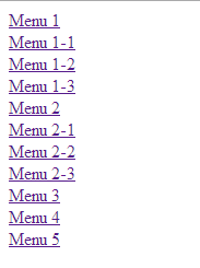
Result 

Step 2: CSS Language
And then we create Menu and using CSS to make Menu that we created, and absolute declaration must be written in space item <head> as below:


<head>
<style type="text/css" rel="stylesheet">
//css code here
</style>
</head>

Step 3: Delete of gap
Because Default Style item ul and li gap so we have to eliminate gap
Using CSS
ul, li{
padding:0;
margin: 0;
}
Result

04. Make Horizontal Menu 

Because of the lessons we have taken to create a horizontal menu so we have to do each item li From left to right by using function Float.


.menu li{
float: left;
}
Result


Step 5: Make Vertical Submenu


300 beautiful logo for Facebook

This is collection of logo for liking show, Comment, Message, Chat that see be stranger for your friend.
Here is 300 logo for show, Comment, Message, Chat please see below

^◡^ <:3 )~ Σ $_$ (✿◠‿◠) Ƹ̴Ӂ̴Ʒ
((|̲̅̅●̲̅̅|̲̅̅=̲̅̅|̲̅̅●̲̅̅|))
๑۩๑ @(ᵕ.ᵕ)@
@};— :’(
:’< :”<
☜♡☞ 웃❤유 <:( ≧❂◡❂≦ =☽ ≧◠◡◠≦✌
◄.► ↢ ↣ ≧◔◡◔≦
<:-( ≧◉◡◉≦
© ٩(●̮̮̃•)۶
ಠ_ರೃ ® ≧✯◡✯≦
(¬‿¬)
ϟ
|:-)
:-) ..^.^..zZzzZZ ЖB=D
;) ‘Ω’
;-) ๏̯̃๏ <:'-(
ͼ(ݓ_ݓ)ͽ 〷◠‿◠〷
>:=@
/╯﹏╰\
@>–;– ^o^ :-* (╥﹏╥)
➳♥ ϟ
۞
Ұ
Δ Ω ʊ
¼
<
£ ½ ؟
¢
¥

Welcome to Khmer developer, today I will teach you to design image that attractive, we will design normal image to have attractive image. So please practice following steps


Create new layer or (Ctrk + N) that have size 500px x 500px and into Filter -> Noise -> Add Noise and set as below :

And then Click (Ctrl + F) to read Noise A little bit more.
And then into Edit -> Define Pattern (To create new Pattern Noise by yourself)
01.Create new layer (Ctrl + N) that have size 500px x 500px and set color #3d3d3d
 as below

02. Select Horizontal Type Tool to writing follow by your requirement the following example:
(Font: Khmer Rotanak Angkor)

03. Set Layer below


04. (Ctrl + J) click on Text Layer to copy it to two and delete layer style.


5. And set the following Layer Style:


Syntax Highlighter is JavaScript plugin that have a function that show code in the website. It’s really to show code easy to visitor because your code have a color and No. in your coding. It can show code such as HTML, CSS, PHP, MySQL, Java Script, VB and many other. Syntax Highlighter is using by Apache, Aptana, Mozilla, Yahoo, Wordpress and many other.

How to write:


How to create Box Shadow with CSS3


In this article, Khmer Developer we will show you to create Box Shadow by using CSS3’s Properties that called name (Box-Shadow) with Box Shadow you will easy to create shadow to other box that can set the value such as Color, Size, Blur and offset.

Syntax box-shadow: horizontal vertical spread colour;


box-shadow: 10px 10px;
box-shadow: 10px 10px 5px #888;
box-shadow: inset 2px 2px 2px 2px black;
box-shadow: 10px 10px #888, -10px -10px #f4f4f4, 0px 0px 5px 5px #cc6600;


Browser that Support such as below:

Internet Explorer 
Firefox  
Chrome
Safari
Opera 


CSS Box Shadow Effect 1

Code HTML


<html>
<head>
<title>CSS3 Box Shadow</title>
<style type="text/css" rel="stylesheet" />
CSS code here
</style>
</head>
<body>
HTML code here
</body>
</html>
Code CSS

.box h3{
text-align:center;
position:relative;
top:80px;
}
.box {
width:70%;
height:200px;
background:#FFF;
margin:40px auto;
}
/*==================================================
* Effect 1
* ===============================================*/
.effect1{
-webkit-box-shadow: 0 10px 6px -6px #777;
-moz-box-shadow: 0 10px 6px -6px #777;
box-shadow: 0 10px 6px -6px #777;
}

CSS Box Shadow Effect 2

Code CSS

.box h3{
text-align:center;
position:relative;
top:80px;
}
.box {
width:70%;
height:200px;
background:#FFF;
margin:40px auto;
}
/*==================================================
* Effect 2
* ===============================================*/
.effect2
{
position: relative;
}
.effect2:before, .effect2:after
{
z-index: -1;
position: absolute;
content: "";
bottom: 15px;
left: 10px;
width: 50%;
top: 80%;
max-width:300px;
background: #777;
-webkit-box-shadow: 0 15px 10px #777;
-moz-box-shadow: 0 15px 10px #777;
box-shadow: 0 15px 10px #777;
-webkit-transform: rotate(-3deg);
-moz-transform: rotate(-3deg);
-o-transform: rotate(-3deg);
-ms-transform: rotate(-3deg);
transform: rotate(-3deg);
}
.effect2:after
{
-webkit-transform: rotate(3deg);
-moz-transform: rotate(3deg);
-o-transform: rotate(3deg);
-ms-transform: rotate(3deg);
transform: rotate(3deg);
right: 10px;
left: auto;
}

CSS Box Shadow Effect 3

Code CSS

.box h3{
text-align:center;
position:relative;
top:80px;
}
.box {
width:70%;
height:200px;
background:#FFF;
margin:40px auto;
}
/*==================================================
* Effect 3
* ===============================================*/
.effect3
{
position: relative;
}
.effect3:before
{
z-index: -1;
position: absolute;
content: "";
bottom: 15px;
left: 10px;
width: 50%;
top: 80%;
max-width:300px;
background: #777;
-webkit-box-shadow: 0 15px 10px #777;
-moz-box-shadow: 0 15px 10px #777;
box-shadow: 0 15px 10px #777;
-webkit-transform: rotate(-3deg);
-moz-transform: rotate(-3deg);
-o-transform: rotate(-3deg);
-ms-transform: rotate(-3deg);
transform: rotate(-3deg);
}
CSS Box Shadow Effect 4

Code CSS

.box h3{
text-align:center;
position:relative;
top:80px;
}
.box {
width:70%;
height:200px;
background:#FFF;
margin:40px auto;
}
/*==================================================
* Effect 4
* ===============================================*/
.effect4
{
position: relative;
}
.effect4:after
{
z-index: -1;
position: absolute;
content: "";
bottom: 15px;
right: 10px;
left: auto;
width: 50%;
top: 80%;
max-width:300px;
background: #777;
-webkit-box-shadow: 0 15px 10px #777;
-moz-box-shadow: 0 15px 10px #777;
box-shadow: 0 15px 10px #777;
-webkit-transform: rotate(3deg);
-moz-transform: rotate(3deg);
-o-transform: rotate(3deg);
-ms-transform: rotate(3deg);
transform: rotate(3deg);
}

CSS Box Shadow Effect 5

Code CSS

.box h3{
text-align:center;
position:relative;
top:80px;
}
.box {
width:70%;
height:200px;
background:#FFF;
margin:40px auto;
}
/*==================================================
* Effect 5
* ===============================================*/
.effect5
{
position: relative;
}
.effect5:before, .effect5:after
{
z-index: -1;
position: absolute;
content: "";
bottom: 25px;
left: 10px;
width: 50%;
top: 80%;
max-width:300px;
background: #777;
-webkit-box-shadow: 0 35px 20px #777;
-moz-box-shadow: 0 35px 20px #777;
box-shadow: 0 35px 20px #777;
-webkit-transform: rotate(-8deg);
-moz-transform: rotate(-8deg);
-o-transform: rotate(-8deg);
-ms-transform: rotate(-8deg);
transform: rotate(-8deg);
}
.effect5:after
{
-webkit-transform: rotate(8deg);
-moz-transform: rotate(8deg);
-o-transform: rotate(8deg);
-ms-transform: rotate(8deg);
transform: rotate(8deg);
right: 10px;
left: auto;
}

CSS Box Shadow Effect 6

Code CSS

.box h3{
text-align:center;
position:relative;
top:80px;
}
.box {
width:70%;
height:200px;
background:#FFF;
margin:40px auto;
}
/*==================================================
* Effect 6
* ===============================================*/
.effect6
{
position:relative;
-webkit-box-shadow:0 1px 4px rgba(0, 0, 0, 0.3), 0 0 40px rgba(0, 0, 0, 0.1) inset;
-moz-box-shadow:0 1px 4px rgba(0, 0, 0, 0.3), 0 0 40px rgba(0, 0, 0, 0.1) inset;
box-shadow:0 1px 4px rgba(0, 0, 0, 0.3), 0 0 40px rgba(0, 0, 0, 0.1) inset;
}
.effect6:before, .effect6:after
{
content:"";
position:absolute;
z-index:-1;
-webkit-box-shadow:0 0 20px rgba(0,0,0,0.8);
-moz-box-shadow:0 0 20px rgba(0,0,0,0.8);
box-shadow:0 0 20px rgba(0,0,0,0.8);
top:50%;
bottom:0;
left:10px;
right:10px;
-moz-border-radius:100px / 10px;
border-radius:100px / 10px;
}


CSS Box Shadow Effect 7

Code CSS

.box h3{
text-align:center;
position:relative;
top:80px;
}
.box {
width:70%;
height:200px;
background:#FFF;
margin:40px auto;
}
/*==================================================
* Effect 7
* ===============================================*/
.effect7
{
position:relative;
-webkit-box-shadow:0 1px 4px rgba(0, 0, 0, 0.3), 0 0 40px rgba(0, 0, 0, 0.1) inset;
-moz-box-shadow:0 1px 4px rgba(0, 0, 0, 0.3), 0 0 40px rgba(0, 0, 0, 0.1) inset;
box-shadow:0 1px 4px rgba(0, 0, 0, 0.3), 0 0 40px rgba(0, 0, 0, 0.1) inset;
}
.effect7:before, .effect7:after
{
content:"";
position:absolute;
z-index:-1;
-webkit-box-shadow:0 0 20px rgba(0,0,0,0.8);
-moz-box-shadow:0 0 20px rgba(0,0,0,0.8);
box-shadow:0 0 20px rgba(0,0,0,0.8);
top:0;
bottom:0;
left:10px;
right:10px;
-moz-border-radius:100px / 10px;
border-radius:100px / 10px;
}
.effect7:after
{
right:10px;
left:auto;
-webkit-transform:skew(8deg) rotate(3deg);
-moz-transform:skew(8deg) rotate(3deg);
-ms-transform:skew(8deg) rotate(3deg);
-o-transform:skew(8deg) rotate(3deg);
transform:skew(8deg) rotate(3deg);
}


CSS Box Shadow Effect 8

Code CSS

.box h3{
text-align:center;
position:relative;
top:80px;
}
.box {
width:70%;
height:200px;
background:#FFF;
margin:40px auto;
}
/*==================================================
* Effect 8
* ===============================================*/
.effect8
{
position:relative;
-webkit-box-shadow:0 1px 4px rgba(0, 0, 0, 0.3), 0 0 40px rgba(0, 0, 0, 0.1) inset;
-moz-box-shadow:0 1px 4px rgba(0, 0, 0, 0.3), 0 0 40px rgba(0, 0, 0, 0.1) inset;
box-shadow:0 1px 4px rgba(0, 0, 0, 0.3), 0 0 40px rgba(0, 0, 0, 0.1) inset;
}
.effect8:before, .effect8:after
{
content:"";
position:absolute;
z-index:-1;
-webkit-box-shadow:0 0 20px rgba(0,0,0,0.8);
-moz-box-shadow:0 0 20px rgba(0,0,0,0.8);
box-shadow:0 0 20px rgba(0,0,0,0.8);
top:10px;
bottom:10px;
left:0;
right:0;
-moz-border-radius:100px / 10px;
border-radius:100px / 10px;
}
.effect8:after
{
right:10px;
left:auto;
-webkit-transform:skew(8deg) rotate(3deg);
-moz-transform:skew(8deg) rotate(3deg);
-ms-transform:skew(8deg) rotate(3deg);
-o-transform:skew(8deg) rotate(3deg);
transform:skew(8deg) rotate(3deg);
}
Note: Effect must to modify Class Name in HTML Code can be process 

In this article, We will teach you to write CSS Class that will use for convert natural color to black color and white color

Step 1: Write code HTML 
<html>
<head>
<title>CSS3 Filter</title>
<style type="text/css" rel="stylesheet">
//css code here
</style>
</head>
<body>
<img src="http://learning.itkonkhmer.com/ImageName.jpg" class="grayscale" />
</body>
</html>


Step 2: Write code HTML To convert picture to write color and black color we will use Filter 3 number are Standard CSS Filter for Webkit Browsers, Svg Filter for Firefox and Microsoft Filter Property for IE 6+
img.grayscale {

/* for Webkit browsere, Chrome 19+, Safari 6+ ... */
-webkit-filter: grayscale(1);

/* this is for Firefox 3.5+, Firefox mobile */
filter: url("data:image/svg+xml;utf8,#gs");

/* for IE6+ */
filter: gray;
}


In this article, Khmer Developer we will teach you to create Carrier Logo for your IDevice by yourself.

Step 1: Before you must install program Zeppelin, you can download through Cydia.

Step 2: Use the program that you favorite to design picture 100 x 40 pixel, 3 times of picture and save it in File of picture, and 3 times of number following named below:

-black@2x.png
-silver@2x.png
-etched@2x.png


Step 3: Copy directory to put File picture and then open program IFunbox or IFile
(In this example we use program IFIle) and then link Device that you use to your computer.

Step 4: Browse to File System -> File System (Jailbreak)-> Library->Zeppelin->And then paste to directory that we copied .

Step 5: (Practice on Device)
Go to Setting ->Zeppelin-> Theme-> and then choose Carrier Logo that you created.


In this article Khmer developer will show (How to put your text that you love when your battery nearly to low battery in IOS Device) for iPad and iPhone,
Please read our example below :
             Step 1. U have to have IFile can be downloaded through Cydia.
             Step 2. Open IFile-> System->Library->CoreService-> SpringBoard app-> English.lproj->                   SpringBroad.string and then you must to change the word that you want to modify as below :


And then have to change ready please save it and Respiring and done.
Please note:
- You must change the article in sign (“”) if you don’t do like this it will error.
- You can’t type Khmer article and Emotion in the box so you must type it in Note page and copy and paste in the box.


When your phone low battery, please close some setting it will can help you to save your iphone long battery. Please see below.
1. Settings > Wi-Fi > Off.
2. Settings > Bluetooth > Off.
3. Settings > Privacy > Location Services > Off.
4. Settings > General > Cellular > Enable 3G > Off.
5. Settings > General > Cellular > Enable LTE > Off.
6. Settings > Sounds > Vibrate on Ring & Silent > Off.
7. Settings > Brightness & Wallpaper > Auto-Brightness > Off.
8. Settings > Mail, Contacts, Calendars > Fetch New Data > Off.w setting that you have to close